
Burger King’s 2021 brand overhaul marked a dramatic shift away from digital-era sleekness back to the nostalgic aesthetic of its golden age, leaning heavily on minimalism, warm color palettes, and a customized typeface to signal a pivot toward real, fresh food.
Introduction: The Philosophy Behind the 2021 Redesign
In January 2021, Restaurant Brands International unveiled a complete global visual identity for Burger King, designed by the creative agency Jones Knowles Ritchie (JKR). The centerpiece of this transformation was a brand-new, yet historically reverent, logo. For nearly two decades prior, Burger King had utilized a glossy, blue-swished, futuristic emblem introduced in 1999. While that badge served the chain through the rise of digital ordering and aggressive globalization, it eventually came to feel dated, overly complex, and detached from the core product: flame-grilled burgers.
The 2021 rebrand solved this by stripping away unnecessary metallic gradients, heavy drop shadows, and arbitrary design elements. Instead, it introduced a flat, minimalist logo heavily inspired by the classic identity Burger King used from 1969 to 1994. This article explores the cultural context, design mechanics, typography choices, and strategic implications of the 2021 Burger King logo redesign.
Historical Context: From 1999 Gloss to 2021 Minimalism
To fully understand why the 2021 logo was so warmly received by design critics and consumers alike, it is necessary to examine what preceded it. Design trends in the late 1990s and early 2000s favored skeuomorphism, computer-generated gradients, and glossy finishes that mimicked real-world textures on flat screens.
The 1999 "Blue Swish" Era
Introduced in 1999, the previous logo featured two stylized hamburger buns clasping the brand name, pierced by a vibrant, asymmetric blue crescent moon. While intended to look dynamic and modern, the blue swish lacked logical grounding within the brand ecosystem—it did not represent water, sky, or any recognizable ingredient. Over time, as mobile applications, responsive web design, and digital menus proliferated, the complex gradients and tiny details of the 1999 logo became difficult to render cleanly at small sizes.
The Return to Heritage
By 2020, design culture had pivoted decisively toward flat design, retro revivals, and functional minimalism. Burger King recognized that its heritage was a powerful differentiator against competitors who leaned into sterile, corporate modernization. By looking backward to the iconic 1969–1994 logo—which featured bold, rounded typography sandwiched between two uniform bun halves—the brand tapped into an era of nostalgic comfort while positioning itself for contemporary digital platforms.
Anatomical Breakdown of the 2021 Logo
The 2021 logo is a masterclass in reductive branding. Every component was meticulously engineered to honor the past while solving modern functional requirements.
1. The Bun Shape and Proportions
Unlike the uneven, organic-looking buns of the 1969 design or the lopsided tilt of the 1999 version, the 2021 buns are symmetrically balanced, minimalist, and geometric. They frame the word "BURGER" snugly, creating a visual metaphor of an actual sandwich. The curvature of the top and bottom buns has been refined to look appetizing, warm, and inviting without relying on glossy highlights or photo-realistic textures.
2. The Color Palette
The color scheme represents a major departure from the cold blues and stark whites of the 1999 era. JKR selected a rich, saturated palette drawn directly from real food ingredients:
- Flame Red: Represents the signature flame-broiling cooking method.
- Flare Orange: Evokes warmth, toasted buns, and cheese.
- Passing Flame Yellow: Adds vibrancy and brightness.
- Melty Green: A subtle nod to lettuce, freshness, and natural ingredients.
- Ground White and Rich Burgers Brown: Used for typography and backgrounds, grounding the bright primary food tones in a sophisticated aesthetic.
Typography: The Custom "Flame" Font
One of the most consequential aspects of the 2021 rebrand was the creation of a proprietary typeface named Flame.
Prior to 2021, Burger King used various standard or slightly modified commercial fonts for its packaging, advertising, and signage. The introduction of the custom Flame typeface gave the brand a distinct, ownable voice across all touchpoints.
Characteristics of the Flame Typeface
- Organic Imperfections: The letterforms are intentionally chunky, rounded, and slightly irregular, mimicking the organic shapes of ingredients like sesame seeds, burger patties, and soft buns.
- High Legibility: Despite its playful, retro appearance, the typeface was engineered to maintain exceptional readability across massive highway billboard signs down to tiny smartphone favicons.
- Culinary Inspiration: The typography feels edible, heavy, and satisfying, reinforcing the physical sensation of eating comfort food.
Strategic Goals and Brand Positioning
A logo redesign for a multinational fast-food conglomerate is never merely an aesthetic exercise; it is a calculated business strategy designed to alter consumer perception, drive sales, and unify global franchises.
Signal of Quality and Clean Ingredients
Ahead of the 2021 visual overhaul, Restaurant Brands International had begun removing artificial colors, flavors, and preservatives from its core menu items, most notably the Whopper. The clean, unpretentious aesthetic of the new logo served as a visual shorthand for this culinary cleanup. By stripping away artificial gloss and digital gimmicks, the brand communicated transparency and a return to wholesome fundamentals.
Digital-First Adaptability
In an era dominated by mobile food delivery apps, social media feeds, and self-service kiosks, logos must perform flawlessly at micro-resolutions. The flat vector shapes and high-contrast color palette of the 2021 design ensure that the logo remains instantly recognizable whether stamped on a greasy paper wrapper, glowing on an app icon, or rendered on a massive drive-thru digital display.
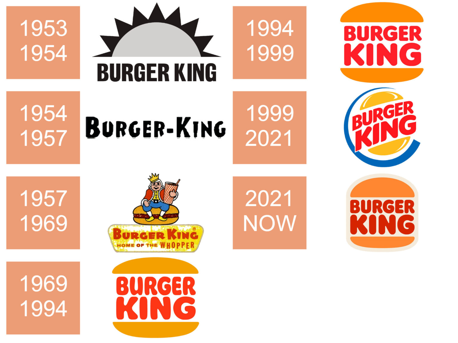
Evolution of Burger King Logos Through the Decades
| Era / Years | Primary Design Characteristics | Strategic Focus |
|---|---|---|
| 1954–1957 | Early, literal typography featuring a king sitting on a burger. | Localized identity and establishing the brand name. |
| 1969–1994 | Red, bold, rounded text sandwiched between two classic bun halves. | National expansion, wholesome appeal, and mass-market recognition. |
| 1994–1999 | Refined typography with a sleeker, slightly flattened bun layout. | Modernizing classic brand equity for the late 20th century. |
| 1999–2021 | Glossy 3D buns wrapped in a dynamic, sweeping blue crescent ring. | Embracing the digital millennium, globalization, and energetic flash. |
| 2021–Present | Flat, minimalist, retro-inspired wordmark encased in symmetric buns with custom typography. | Heritage revival, digital optimization, and real-food positioning. |
Frequently Asked Questions
Why did Burger King change its logo in 2021?
Burger King changed its logo in 2021 to pivot away from the dated digital aesthetic of the late 1990s and signal a renewed commitment to fresh, real food. The minimalist design honors the brand's golden-age heritage from 1969 to 1994 while optimizing the visual identity for mobile apps, digital ordering kiosks, and modern packaging.
Is the 2021 logo completely new, or is it based on an older design?
The 2021 logo is a deliberate homage to Burger King's iconic visual identity used from 1969 through 1994. While inspired by that classic retro era, the 2021 version features modernized proportions, simplified geometric curves, and a custom-designed proprietary typeface called Flame.
What agency designed the 2021 Burger King rebrand?
The global visual redesign was conceived and executed by Jones Knowles Ritchie (JKR), a prominent design agency known for brand transformations across the food and beverage sector. JKR handled everything from the logo and packaging to restaurant interior concepts, employee uniforms, and digital assets.
What colors are used in the 2021 Burger King brand identity?
The 2021 color palette draws inspiration directly from real food ingredients. It features warm, appetizing tones including Flame Red, Flare Orange, and Passing Flame Yellow, complemented by Melty Green and Rich Burgers Brown. These replace the cold blues and stark whites of the previous era.
How does the 2021 logo perform on digital platforms?
The logo was engineered specifically for a digital-first environment. Its flat vector design, high-contrast color blocking, and lack of complex gradients or drop shadows allow it to scale down cleanly to tiny smartphone app icons and social media avatars without losing legibility or brand recognition.
Practical Takeaways and Next Actions
For brand strategists, designers, and business owners studying the 2021 Burger King rebrand, the primary lesson is the power of authenticity and heritage. When modernizing a legacy brand, looking backward to a time when the core product was celebrated in its simplest form can often yield a more resonant identity than chasing fleeting digital design trends. To apply these insights to your own projects:
- Audit Your Heritage: Evaluate whether early versions of your brand identity carried stronger emotional resonance than your current look.
- Prioritize Functional Scaling: Ensure any new logo design renders cleanly in monochrome, at micro-sizes on mobile screens, and across diverse physical packaging materials.
- Align Visuals with Product Reality: Ensure your visual identity genuinely reflects the quality, ingredients, and values of your physical offerings.
Image Gallery
Select an image to open it in a new tab.



Akira Tanaka
International Academic Trends Correspondent
