
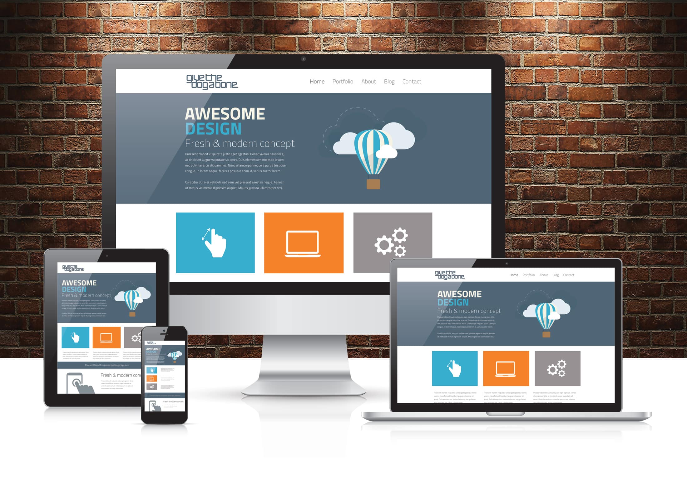
Dynamic web development for responsive sites involves building data-driven applications that utilize server-side or client-side scripting to generate content that automatically adapts to any screen size. By combining fluid CSS layouts, container queries, and modern JavaScript frameworks, developers create high-performance interfaces that provide seamless user experiences across mobile, tablet, and desktop devices.
The Evolution of Dynamic Content in a Responsive Landscape
As we navigate through 2026, the distinction between a "mobile site" and a "desktop site" has entirely vanished, replaced by a unified approach to web architecture. Dynamic web development refers to the process where a site’s content is not hard-coded into individual HTML files. Instead, it is generated on-the-fly, often drawing from a database or an API. When this logic is applied to responsive design, the challenge shifts from merely "fitting content" to "optimizing data delivery" based on the user's context.
A responsive site must respond to more than just screen width; it must respond to connection speed, device capabilities, and user preferences. Dynamic development facilitates this by allowing the server or the client-side application to make decisions about what to load. For instance, a dynamic site might serve a high-resolution video to a desktop user on a fiber connection while serving a static optimized image to a mobile user on a restricted data plan. This intelligent delivery is the hallmark of modern web engineering.
Core Pillars of Dynamic Responsive Development
To build a robust dynamic site in 2026, developers must master four critical pillars: fluid infrastructure, component-based architecture, state management, and server-side optimization.
Fluid Infrastructure and Modern CSS
Responsive design used to rely heavily on "breakpoints"—specific pixel widths where the layout would jump from one configuration to another. While media queries remain relevant, container queries have become the standard for dynamic sites. Container queries allow a component to change its layout based on the size of its parent container rather than the entire viewport. This is essential for dynamic sites where components might be injected into different parts of a page depending on user data.
Furthermore, the use of CSS Grid and Flexbox has matured. Developers now use these tools to create "intrinsic layouts" that don't require rigid media queries at all. By using functions like clamp(), min(), and max(), typography and spacing scale dynamically and fluidly, ensuring that the interface remains readable regardless of the hardware.
Component-Based Architecture
Dynamic development is almost synonymous with component-based frameworks such as React, Vue, or Svelte. These libraries allow developers to build encapsulated units of UI that manage their own logic and styling. In a responsive context, a "Card" component might display an image, a title, and a long description on a desktop. On a mobile device, that same dynamic component might hide the description or transform into a horizontal layout to save vertical space.
Intelligent State Management
State management involves tracking what the user is doing and how the application should react. In dynamic responsive sites, state often dictates the visibility of navigation elements. For example, a "sidebar" state might be toggled on for wide screens but hidden behind a "hamburger" menu on smaller screens. Managing this state efficiently ensures that the transitions between different responsive views are smooth and do not cause "layout shift," which can negatively impact performance metrics like Core Web Vitals.

Server-Side vs. Client-Side Rendering in 2026
One of the most significant decisions in dynamic web development is where the "dynamic" part happens. In 2026, the industry has leaned heavily toward Hybrid Rendering models, popularized by frameworks like Next.js and Remix.
- Server-Side Rendering (SSR): The server generates the HTML for each request. This is excellent for SEO and ensures that the initial responsive layout is visible to the user as soon as the first byte arrives. For responsive sites, SSR allows the server to detect device headers and send a tailored version of the initial HTML.
- Static Site Generation (SSG) with Hydration: Pages are pre-built at build time, but "hydrated" with JavaScript once they reach the browser. This provides the speed of a static site with the interactivity of a dynamic one.
- Client-Side Rendering (CSR): The browser downloads a minimal HTML file and then uses JavaScript to build the entire site. While flexible, it can be slower on mobile devices with limited processing power, making it less ideal for purely responsive-first strategies unless managed carefully.
Technical Requirements for Implementation
Building a dynamic, responsive site requires a modern stack that prioritizes speed and flexibility. Below are the primary technical requirements:
- Version Control: Git is mandatory for managing complex dynamic codebases.
- Package Management: Tools like npm or pnpm to manage dependencies and framework libraries.
- API Layer: A REST or GraphQL API to fetch dynamic content from a database (such as PostgreSQL or MongoDB).
- CSS Pre-processors or Utility Frameworks: Tailwind CSS remains a dominant choice in 2026 for its ability to apply responsive utility classes directly to dynamic components.
- Edge Computing: Utilizing platforms like Vercel or Cloudflare Workers to run dynamic logic closer to the user, reducing latency for responsive adjustments.
Comparing Dynamic Frameworks for Responsive Design
Choosing the right framework depends on the specific needs of the project, such as the complexity of the data and the required speed of the responsive transitions.
| Framework | Rendering Method | Responsive Strength | Best Use Case |
|---|---|---|---|
| Next.js | Hybrid (SSR/SSG) | Excellent Image Optimization and Middleware for device detection. | E-commerce and large content portals. |
| SvelteKit | Compiled / SSR | Minimal bundle size, leading to faster mobile load times. | High-performance dashboards and interactive tools. |
| Astro | Multi-page / Islands | "Islands Architecture" loads JS only for interactive components. | Content-heavy sites where speed is the primary responsive goal. |
| React (Vite) | Client-Side / SPA | Massive ecosystem of responsive UI libraries (MUI, Radix). | Complex web applications and internal tools. |
Step-by-Step Development Workflow
The process of creating a dynamic responsive site involves more than just coding; it requires a strategic approach to design and data.
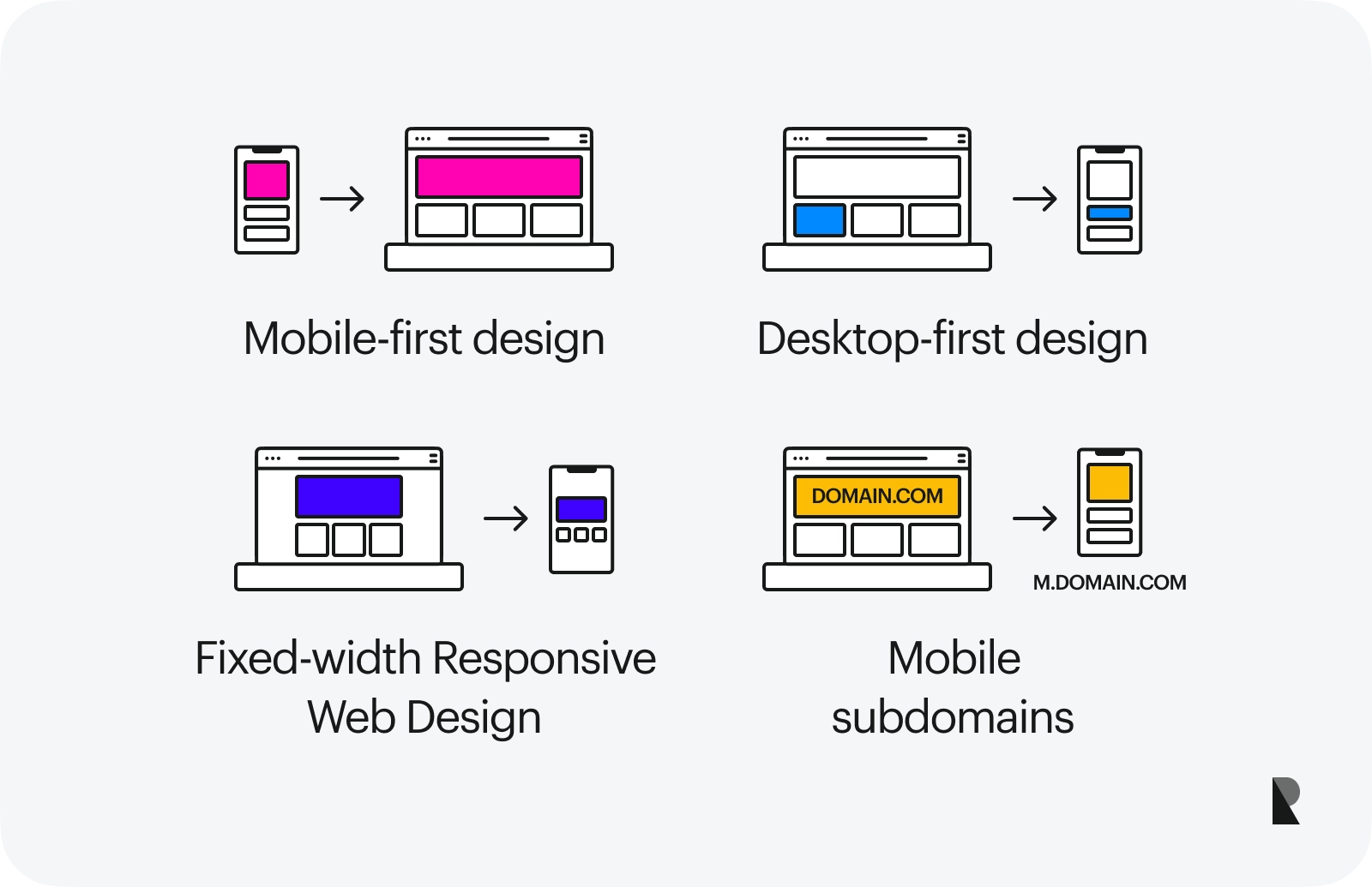
1. Mobile-First Data Strategy
Start by defining the minimum data required for a mobile user. Dynamic sites often fail by trying to load too much data on small screens. Design your API queries to fetch only the essential fields for mobile views, using "lazy loading" or "pagination" for additional details that appear on larger screens.
2. Implementing Fluid Grids
Set up a global CSS configuration using CSS Grid. Define columns that adapt using repeat(auto-fit, minmax(300px, 1fr)). This ensures that your dynamic content automatically wraps and scales without needing a dozen different media queries.
3. Developing Dynamic Components
Create components that use props to determine their layout. For example, a
4. Integration with a CMS or Database
Connect your frontend to a headless CMS (like Contentful or Strapi) or a direct database. Ensure that the media stored in the database is handled by a dynamic image service (like Cloudinary) that can resize images on-the-fly based on the requesting device's screen size.
5. Optimizing for the "Next Billion Users"
In 2026, dynamic development must account for varying hardware capabilities. Use "Feature Detection" to disable heavy dynamic animations or complex 3D renders on lower-end mobile devices while keeping them active for high-end desktop users.
Performance Verification and Troubleshooting
Verification is a continuous process in dynamic development. Because content is dynamic, a site might look perfect with one set of data but break with another.
- Visual Regression Testing: Use tools like Percy or Playwright to automatically take screenshots of your responsive layouts whenever the dynamic data changes.
- Lighthouse Audits: Regularly run audits to check for Cumulative Layout Shift (CLS). Dynamic content loading (like ads or slow-loading images) is the leading cause of CLS on mobile devices.
- Throttling Tests: Always test your dynamic site using "3G Throttling" in Chrome DevTools. This reveals how your dynamic assets (JavaScript bundles and API calls) affect the user experience on slower mobile networks.
Common mistakes include using fixed widths on dynamic elements, failing to set aspect-ratio on dynamic images, and over-relying on client-side JavaScript for basic layout tasks. Addressing these during the development phase prevents costly refactors after launch.
Frequently Asked Questions
What is the difference between dynamic and responsive web design?
Responsive design refers to the visual layout and its ability to adapt to screen sizes using CSS. Dynamic web development refers to the functional side, where content is generated from a database or logic rather than static files. A "dynamic responsive site" uses both: it generates custom content and then ensures that content looks great on any device.
Do I need a framework like React to build a dynamic responsive site?
While not strictly necessary—you can use vanilla JavaScript and PHP—modern frameworks provide the tools needed to manage the complexity of dynamic UIs efficiently. They offer better ways to handle component-level responsiveness and state management, which are difficult to maintain in large-scale projects using only vanilla code.
How do container queries differ from media queries in 2026?
Media queries look at the "Viewport" (the whole browser window). Container queries look at the specific "Parent element." For dynamic sites, container queries are superior because they allow a reusable component to be placed in a sidebar, a main column, or a full-width section and adapt its layout correctly based solely on the space available to it.
How does dynamic development affect mobile SEO?
If handled correctly via Server-Side Rendering (SSR) or Static Site Generation (SSG), dynamic development is excellent for SEO. Google and other search engines prioritize "Mobile-First Indexing." Providing a fast, dynamic, and responsive experience signals to search engines that your site is high-quality and user-friendly.
Can dynamic sites work offline on mobile devices?
Yes, by implementing Service Workers and turning your dynamic site into a Progressive Web App (PWA). This allows the site to cache dynamic data and provide a responsive interface even when the user has no internet connection, which is a standard expectation for high-end dynamic sites in 2026.
Practical Recommendation
For those starting a new project in 2026, the most effective path forward is to adopt a TypeScript-based framework with hybrid rendering capabilities, such as Next.js or SvelteKit. Begin your project with a mobile-first CSS utility library like Tailwind CSS to handle the responsive layer, and prioritize Server-Side Rendering for your initial page loads to ensure maximum performance and SEO reach. Always validate your dynamic layouts with real-world data early in the design phase to identify edge cases where long strings of text or large images might break your responsive grid.
To learn more about the latest standards in responsive design and dynamic rendering, visit the W3C Mobile Web Best Practices or explore the comprehensive documentation on MDN Web Docs regarding CSS Layouts.
Image Gallery
Select an image to open it in a new tab.





Omar Farooq
EdTech Innovation and Virtual Pedagogy Journalist
