Warm and Cool Colors: Definitions and Visual Impact
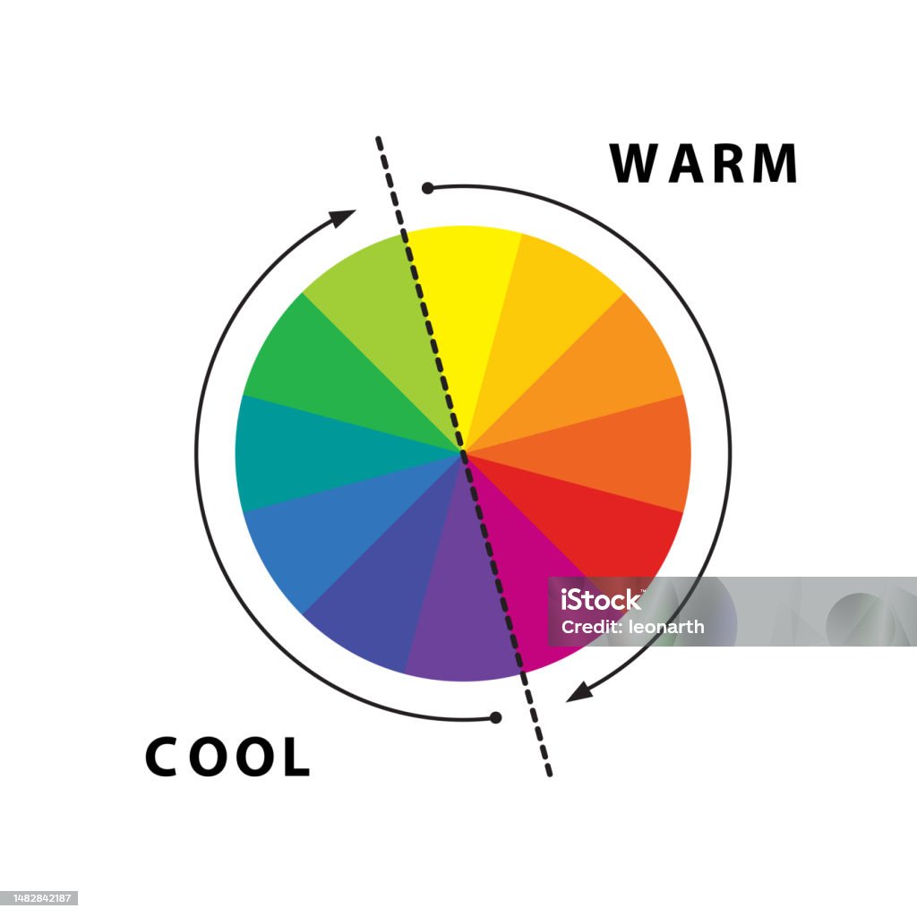
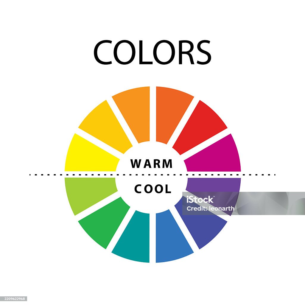
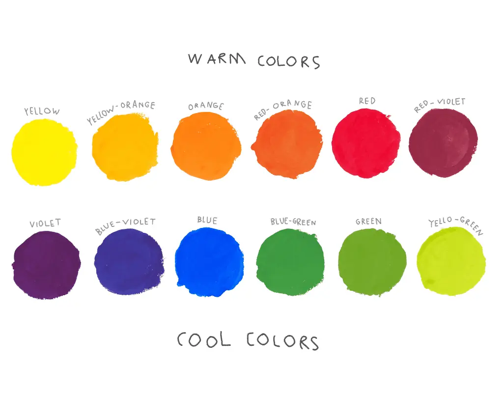
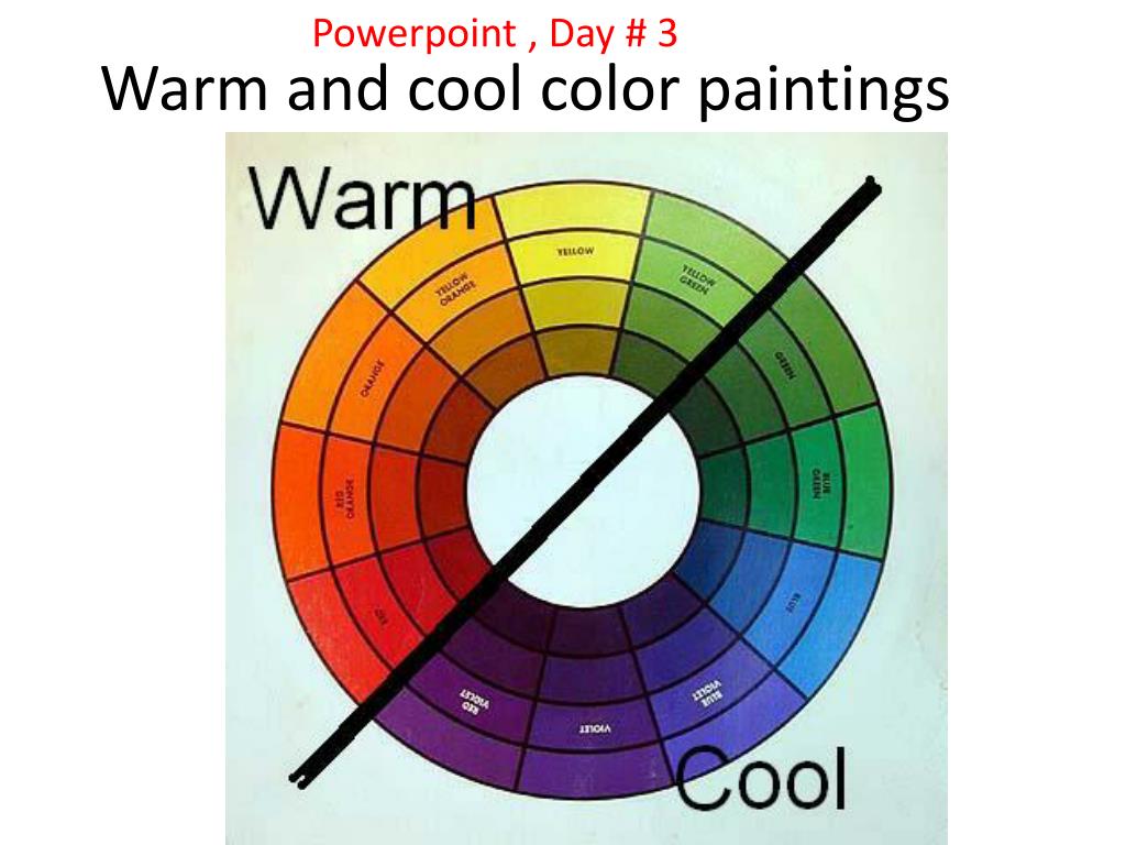
Warm colors encompass the spectrum of red, orange, and yellow, while cool colors include blue, green, and purple. This dichotomy functions as a fundamental tool in design, art, and psychology, where warm tones are perceived to advance toward the viewer and radiate energy, while cool tones appear to recede, creating a sense of calm, professionalism, and spatial expansion.
Defining the Color Temperature Spectrum
Color temperature is a subjective yet systematic way of categorizing hues based on the psychological and physiological associations they trigger. By placing colors on a temperature scale, designers and artists can manipulate the mood of a space, the readability of a website, or the emotional resonance of a marketing campaign.
The Warm Spectrum
Warm colors are defined by their proximity to the colors of fire, sunlight, and sunset. They typically contain high concentrations of red or yellow pigment.
- Red: Associated with passion, urgency, and intensity. It is the most dominant warm color, often used to command immediate attention.
- Orange: Represents enthusiasm, creativity, and warmth. It balances the aggression of red with the friendliness of yellow.
- Yellow: Symbolizes optimism, joy, and intellectual stimulation. It is highly visible and often used to create a cheerful focal point.
In the 2026 design landscape, the strategic use of warm tones remains a go-to for brands aiming to foster intimacy or urgency. These colors are physically active; they stimulate the viewer and are often used in retail settings to encourage impulsive actions or in interior design to make large, cavernous spaces feel cozy.
The Cool Spectrum
Cool colors are associated with water, sky, ice, and lush foliage. These hues sit on the opposite side of the color wheel.
- Blue: Generally perceived as the most professional and trustworthy color. It is linked to stability, intelligence, and calmness.
- Green: Bridges the gap between the cool and warm spectrums but is generally classified as cool. It represents growth, health, and tranquility.
- Purple: Often associated with luxury, mystery, and creativity. Depending on its undertones, it can lean slightly warmer or cooler.
Cool colors are generally perceived as relaxing and less taxing on the eye. They are standard in corporate branding, healthcare, and software interfaces, where the primary objective is to maintain user focus without overwhelming them.
The Visual Impact of Temperature on Perception
The distinction between warm and cool is not merely aesthetic; it has measurable impacts on human spatial and emotional perception. Understanding these mechanics is essential for professionals in architecture, digital interface design (UI/UX), and fine arts.
Spatial Advancement and Recession
One of the most significant phenomena in optics is that warm colors appear to "advance" or move toward the viewer, while cool colors "recede" or pull away.
- Advancement (Warm): Because warm colors capture attention more aggressively, they make objects appear larger and closer. In interior design, painting a wall a warm, saturated color will make that wall feel as though it is enclosing the space, effectively reducing the perceived size of a room.
- Recession (Cool): Cool colors tend to flatten or recede into the background. Using cool, desaturated tones on walls can make a small room feel significantly more spacious and airy.
Psychological and Physiological Response
The human autonomic nervous system reacts differently to these color categories. Research in environmental psychology consistently shows that exposure to warm, vibrant colors can increase heart rates and respiration, leading to heightened alertness. Conversely, exposure to cool, muted colors often results in a decrease in blood pressure and a slower, more deliberate breathing pattern.
| Feature | Warm Colors | Cool Colors |
|---|---|---|
| Primary Associations | Energy, Passion, Urgency | Calm, Trust, Stability |
| Spatial Effect | Objects look larger/closer | Objects look smaller/further |
| Physical Impact | Stimulates, raises heart rate | Soothes, lowers heart rate |
| Best Application | Calls-to-Action, cozy areas | Long-term content, workspaces |
Strategic Application in Modern Design
In 2026, the application of color temperature is increasingly data-driven, particularly in digital product design. Designers must balance the visual impact of temperature with usability requirements such as accessibility and cognitive load.
UI/UX Design and Accessibility
When designing for screens, high-contrast warm colors (like bright red on a white background) can cause "chromostereopsis," a visual distortion where the two colors appear to vibrate against each other. This is not only distracting but physically uncomfortable for many users.
Effective UX design relies on the "60-30-10" rule: 60% of the design should be a neutral or base color, 30% a secondary color, and 10% a vibrant accent color. Designers often use a cool, neutral base (like slate or soft blue) to ensure readability, while reserving warm, vibrant colors for specific elements that require user interaction, such as "Submit" buttons or alert notifications.
Interior Environments and Lighting
The interaction between artificial light and pigment is critical. If a room has cool, north-facing natural light, using cool paint colors can make the space feel sterile or "chilly." Introducing warm furniture or lighting fixtures balances the temperature, creating a comfortable environment. Conversely, in a room flooded with warm, direct sunlight, cool colors help mitigate the intensity, creating a balanced and refreshing atmosphere.
Common Mistakes and How to Avoid Them
Even professionals can fall into traps when working with color temperatures. Recognizing these errors early can save significant rework time.
- Over-saturation: Relying too heavily on warm colors can create "visual noise." If everything in a design is "loud" or vibrant, the user loses their focus.
- Neglecting Undertones: A common error is assuming all blues are cool. A blue with a high concentration of red, such as periwinkle, can actually carry warm undertones. Always examine the color's base.
- Ignoring Accessibility: Using only color to convey information (e.g., using red for an error and green for a success) fails users with color blindness. Always supplement color choices with icons or text labels.
- Cultural Inconsistency: While the warmth-coolness dichotomy is widely accepted, cultural interpretations of specific colors vary. For example, while red often signals "danger" or "urgency" in Western contexts, it carries connotations of "good fortune" in various Eastern cultures.
Frequently Asked Questions
Is black or white considered warm or cool?
Black and white are technically neutrals. However, they are often assigned temperatures based on their undertones. A "warm white" has yellow or red undertones, often described as creamy, while a "cool white" has blue undertones, appearing stark or clinical.
Why do some colors feel like they don't fit?
This often happens when colors of clashing temperatures are placed in a way that ignores visual hierarchy. If you place a "cool" item against a "warm" background, it creates contrast. If the contrast is too harsh without a bridge or transition, it can look jarring.
Can I mix warm and cool colors in the same space?
Yes, and it is often encouraged. Mixing temperatures creates visual balance. The key is to establish a primary temperature—perhaps 70% cool for a professional office—and then use the remaining 30% for warm accents to provide warmth and interest without overwhelming the space.
Do skin tones dictate the colors I should wear or use?
Yes. Color theory extends to personal styling. Those with "cool" undertones in their skin generally look best in jewel tones like sapphire or emerald, while those with "warm" undertones often look best in earthy tones like mustard, olive, or terracotta.
How does color temperature affect battery usage on mobile devices?
On OLED displays, colors like white and warm brights (like yellow/red) require all sub-pixels to fire, consuming more energy. Darker, cooler colors (like deep blues or black) allow individual pixels to turn off or dim, which is why "dark mode" is often preferred for battery longevity.
Final Recommendation: Balancing Your Palette
To effectively use color temperature, begin by identifying the primary emotional goal of your project. If you are designing a space for relaxation or professional focus, anchor your palette in the cool spectrum. If your goal is to trigger excitement, movement, or a sense of comfort, lean toward the warm spectrum.
Once your base is established, use the opposite temperature sparingly as an accent to create focal points. Test your color combinations in the specific lighting or interface context where they will exist, as environmental factors will invariably alter the perceived temperature of your chosen hues. Remember that color is a tool of perception; when in doubt, prioritize readability and user comfort over pure aesthetic trends.
Image Gallery
Select an image to open it in a new tab.
Celine Dubois
Contemporary Living and Global Arts Columnist
