Gerald Scarfe’s Role in Pink Floyd’s The Wall: A Visual Architecture of Alienation

Gerald Scarfe’s role in Pink Floyd’s The Wall was foundational, acting as the primary visual architect who translated the band’s abstract themes of isolation, trauma, and societal decay into a visceral, iconic aesthetic. Beyond merely providing album cover art, Scarfe was responsible for the character design, the elaborate animated sequences, and the distinctive stage imagery that defined the project’s identity across the 1979 album, the 1982 film, and the subsequent world tours.
The Genesis of the Collaboration
The partnership between Pink Floyd and Gerald Scarfe did not begin with The Wall; it originated during the 1977 In the Flesh tour. Roger Waters, the creative force behind the album, had long admired Scarfe’s biting, grotesque political caricatures in publications like The Sunday Times. Waters sought an artistic partner who could match the cynical, raw intensity of his music.
When development of The Wall commenced in late 1978, the project was conceptualized as a multimedia experience rather than a traditional record. Waters brought Scarfe into the inner circle early, allowing the artist to immerse himself in the lyrics and narrative arc of the protagonist, Pink. This collaboration was symbiotic: as Waters wrote about the metaphorical walls built by individuals to protect themselves from emotional pain, Scarfe drew the physical manifestations of that psyche, creating a visual language that felt as fractured as the protagonist's mental state.
Character Design and Symbolic Imagery
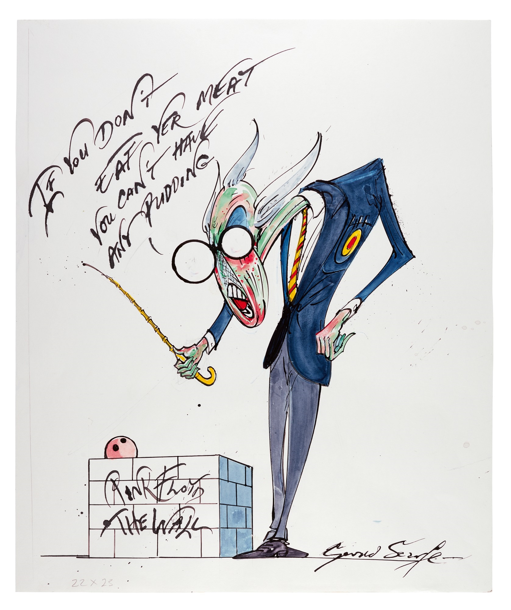
Scarfe’s most enduring contribution to the project is his collection of grotesque, distorted characters. His style—characterized by spindly limbs, jagged lines, and visceral color palettes—perfectly captured the decay of authority and the dehumanization of society.
Key visual elements designed by Scarfe include:
- The Schoolmaster: A monstrous, towering figure representing the rigidity and cruelty of the British education system, which crushes the individuality of children.
- The Mother: Depicted as an overbearing, vine-like entity that physically suffocates her son, reflecting Pink’s lifelong struggle with smothering parental attachment.
- The Wife: A predatory, transforming figure that emphasizes Pink’s paranoia regarding intimacy and betrayal.
- The Worms: Manifestations of mental decay and societal rot, crawling through the psyche of the protagonist and consuming his remaining sanity.
These designs were not merely illustrations; they were functional icons that served as the primary shorthand for the band’s narrative. The simplicity of the "brick" aesthetic, combined with Scarfe’s chaotic, nightmarish line work, allowed for a high degree of recognizability, which proved vital when translating the album’s story to film and stage.

Animation for the Feature Film
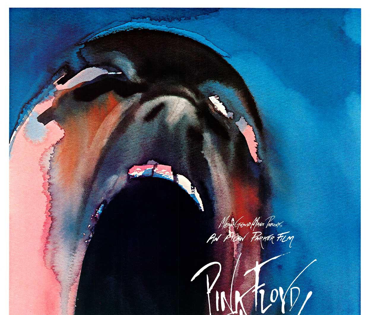
While the 1979 album relied on Scarfe’s iconic minimalist brick-pattern cover, his involvement expanded exponentially with the 1982 feature film, directed by Alan Parker. Scarfe was tasked with creating approximately 15 minutes of animated sequences that would bridge the gaps in the live-action narrative.
These animations were not just accompaniments to the music; they were essential components of the storytelling. The most famous sequence, set to "The Trial," allowed Scarfe to employ his signature "nightmare" aesthetic to the fullest extent. In this scene, the judge—a towering, phallic entity—metaphorically deconstructs Pink’s ego, with the characters Scarfe designed earlier in the film appearing as witnesses against him. The transition from fluid, nightmarish sketches to the final animated sequences represented a massive technical undertaking, involving hundreds of hours of rotoscoping and hand-painted frames that set a high water mark for integration of animation and live-action cinema in the early 1980s.
Scenography and the Live Stage Show
The Wall tour, which began in 1980, presented the logistical challenge of physically representing the album's concept. Scarfe’s role shifted from illustrator and animator to stage designer. He was instrumental in conceptualizing the building of the massive wall itself, a structure that physically grew to obscure the band from the audience.
The inflatable puppets used during the live shows were directly based on Scarfe’s drawings. The "Teacher," the "Mother," and the "Wife" were brought into three-dimensional existence as giant, terrifying balloons that loomed over the stadium. This choice of set design served two purposes:
- Narrative: It mirrored the psychological barriers the audience was experiencing as they were separated from the performers.
- Thematic: It reinforced the idea that the "monsters" in Pink’s life had become external, uncontrollable forces.
| Element | Format | Primary Role |
|---|---|---|
| Album Cover | Static Illustration | Established the minimalist "brick" brand identity. |
| Stage Inflatables | 3D Physical Props | Provided looming, physical threats during live performance. |
| The Trial | Animation | Expressed the protagonist's descent into madness visually. |
| Music Video | Mixed Media | Used for "Another Brick in the Wall, Part 2" to create a distinct visual hook. |
The "Brick" Aesthetic and Minimalism
A common misconception regarding The Wall is that the visual project is solely "grotesque." In reality, Scarfe’s work is a study in the tension between hyper-detailed nightmare sequences and stark, brutalist minimalism. The iconic brick pattern—a simple white wall with black grout—became the branding for the entire project.
This design choice was a collaborative decision between Scarfe and the band to ensure that the visual representation would be instantly recognizable. By keeping the main visual symbol so austere, Scarfe ensured that whenever the audience saw the brick pattern, they immediately associated it with the specific themes of the album. This branding strategy was one of the most successful in the history of rock music, effectively turning a static image into a global icon of isolation.
Influence on Future Multimedia Productions
The collaboration between Pink Floyd and Gerald Scarfe changed how bands approached the relationship between audio and visual art. Before The Wall, music videos and stage projections were often secondary considerations. Scarfe proved that visual artists could be as integral to a concept album as the session musicians themselves.
Modern touring artists—from stadium-filling rock bands to electronic music producers—frequently cite the visual cohesion of The Wall as a template for their own stage productions. The use of animation to replace missing band members, the integration of physical set pieces with narrative projections, and the use of a unified visual "brand" all owe a significant debt to the work Scarfe produced for this project.
FAQ: Understanding the Visual Legacy of The Wall
Did Gerald Scarfe work on the lyrics for The Wall? No, the lyrics were written by Roger Waters. Scarfe’s role was strictly visual. He worked closely with Waters to interpret the narrative, but he did not contribute to the songwriting process. His job was to translate the sonic and lyrical themes into a cohesive visual vocabulary.
Is Gerald Scarfe still involved in Pink Floyd anniversary projects? As of 2026, while the band is no longer a touring entity in its original form, Scarfe’s imagery remains the definitive visual representation of the The Wall legacy. His prints, sketches, and archives continue to be exhibited in major galleries and used in official commemorative reissues.
Why are the animated sequences in the film so much darker than the album artwork? The album artwork was designed to be iconic and recognizable, whereas the film was a narrative work that required visual progression. The darkness of the animated sequences—especially during "The Trial"—was intended to match the psychological breakdown of the character. Scarfe used the film's runtime to show the "inhabitants" of Pink’s mind, which necessitated more complex and disturbing imagery than a single cover illustration could convey.
What happened to the original stage inflatables? Most of the original inflatables used in the 1980–1981 tour were either destroyed or lost over time, as they were made of materials not intended to survive four decades. However, exact replicas have been painstakingly created for subsequent anniversary events and retrospective exhibitions based on Scarfe’s original design schematics.
Did Scarfe’s designs influence the sound of the album? While the music preceded the final visual designs, there was an iterative feedback loop. Seeing the visual representations of the "Schoolmaster" or the "Worms" often pushed the band to tighten the musical compositions to match the intensity of the imagery. It was a true collaborative environment where visual feedback influenced artistic choices on both sides.
Recommendation for Further Exploration
For those interested in the technical intersection of music and art, I recommend reviewing the "The Wall: A Visual History" archives, which catalog the original hand-drawn sketches by Scarfe. Observing the transition from early pencil drafts to the final high-contrast ink drawings provides invaluable insight into how an artist synthesizes complex psychological themes into iconic, legible symbols. If you are a student of graphic design or animation, look specifically at the rotoscoping techniques utilized in the film's "Waiting for the Worms" sequence; it remains a masterclass in using motion to convey a sense of dread and inevitability.
Image Gallery
Select an image to open it in a new tab.


Akira Tanaka
International Academic Trends Correspondent
