How to Create a Team Logo Step by Step: A Professional Design Guide
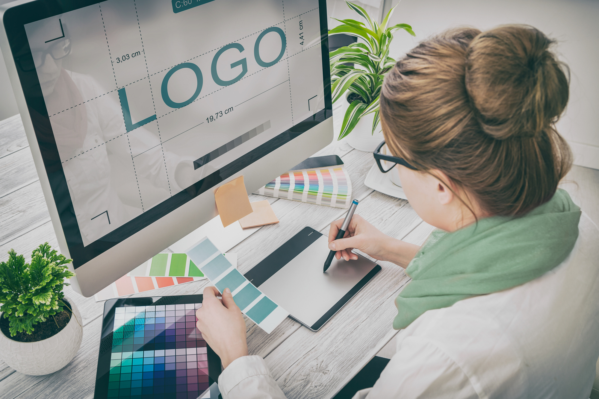
Creating a team logo requires a strategic blend of visual communication, brand identity, and technical preparation. The process involves defining your team’s core values, sketching initial concepts, refining the design for scalability, and selecting the appropriate file formats for both digital and physical applications to ensure a professional, consistent representation across all media.
Defining the Brand Identity
Before opening any design software, you must define what your team stands for. A logo is not just a graphic; it is a visual shorthand for your team’s culture, mission, and personality. Start by writing down three to five adjectives that describe your team (e.g., "resilient," "innovative," "traditional," or "agile"). These keywords will dictate the visual language of your project.
Consider the context in which the logo will live. A high-school sports team requires a different aesthetic—often bold, aggressive, and high-contrast—than a corporate software development team, which might prioritize minimalism, clean typography, and a sophisticated color palette. Research the logos of teams in similar niches to understand industry standards, but focus on differentiation. If your competitors use thin lines and blue gradients, consider how a bolder weight or a complementary color scheme can make your brand stand out.
Sketching and Conceptualization
Effective logo design begins with analog tools. Sketching on paper allows you to iterate rapidly without the constraints of technical software. Focus on "thumbnail" sketches—small, rough drawings that capture the essence of a shape or an icon. Do not aim for perfection; aim for volume.
Once you have a collection of thumbnails, select the strongest three to five concepts. Evaluate them against your core adjectives. Does the shape evoke the right emotion? Is it readable at a small size? At this stage, think about the three pillars of a great logo:
- Simplicity: Can the logo be identified in under two seconds?
- Relevance: Does the imagery align with the team's objective?
- Versatility: Does the design work as well on a business card as it does on a billboard or a team jersey?
Selecting Design Tools and Software
The technical execution of your logo should ideally happen in vector-based software. Unlike raster images (which are made of pixels), vector graphics are made of mathematical paths. This allows you to scale your logo to any size—from a favicon on a website to a large-scale stadium banner—without losing resolution or quality.
Industry standards for vector design include Adobe Illustrator and Affinity Designer. For teams with limited budgets, open-source options like Inkscape are highly capable. While some users attempt to create logos in raster editors like Adobe Photoshop, this is generally discouraged for final logos because the resulting file will be difficult to resize without pixelation.
The Construction Phase: Digital Implementation
Once you have moved your sketches into your chosen software, the process of vectorization begins. Trace your sketches using the Pen Tool or by manipulating geometric primitives like circles and rectangles.
- Typography: The choice of font is as important as the icon itself. Serif fonts often convey authority and tradition, while sans-serif fonts suggest modernity and clarity. Ensure the kerning (the spacing between letters) is balanced.
- Color Theory: Limit your palette to two or three primary colors. Use a color wheel to find complementary or analogous colors that provide high contrast. Ensure your logo also functions well in monochrome (black and white), as you will eventually need to print it on documents, receipts, or stamps where color is not available.
- Negative Space: Some of the most iconic logos utilize negative space to hide secondary meanings or create visual tension. Experiment with how your icon interacts with the text.
Comparing Design Approaches
| Approach | Pros | Cons |
|---|---|---|
| DIY (Vector Software) | Full control, low cost, unique outcome. | High learning curve, time-intensive. |
| Online Logo Builders | Extremely fast, low barrier to entry. | Generic results, lack of unique brand ownership. |
| Professional Designer | High-quality, strategic, original. | Highest financial investment. |
| Crowdsourcing | Variety of concepts, mid-range cost. | Quality varies, lack of ongoing collaboration. |
Refining and Technical Verification
After the primary design is complete, perform a "stress test." View your logo at different scales. If you are designing for a team jersey, consider how the design will look when embroidered or screen-printed. These mediums often struggle with fine gradients or extremely thin lines.
Adjust your stroke weights to ensure the logo is "bold" enough to withstand these printing processes. Verify that all paths are closed and that there are no stray nodes or artifacts. If your team intends to use the logo on official stationery or merchandise, ensure you have established a "clear space" guide—a minimum buffer area around the logo where no other text or graphics should appear.
File Preparation and Delivery
A professional logo package is not a single file; it is a library of assets. You must export your design in multiple formats to ensure compatibility with different software and vendors.
- Vector Master Files: Save the original in .AI or .SVG format. This is your "source of truth."
- High-Resolution Rasters: Export .PNG files with transparent backgrounds for use on websites, presentations, and social media.
- Print-Ready Files: Use .PDF or .EPS files for high-quality printing. These formats preserve vector data and are requested by professional print shops.
Common Mistakes to Avoid
Many designers fall into the trap of over-complicating the design. If a logo requires a paragraph of explanation to be understood, it is too complex. Another common error is failing to consider the "horizontal vs. vertical" layout. A long, rectangular logo may work for a website header but look terrible on a circular social media profile picture. Always design a primary logo and a simplified "sub-mark" or icon version for tight spaces.
Troubleshooting Design Hurdles
If you find your design feels "flat," look at your line weights. Sometimes, adding a secondary stroke or a slight variation in the thickness of lines can add depth without requiring complex shadows. If the color feels off, check your color profile. Ensure you are working in CMYK for any print projects, as the RGB colors viewed on a screen often appear duller when translated to physical ink. If your monitor is not color-calibrated, rely on Pantone matching system (PMS) swatches to ensure your team colors remain consistent across different print runs.
Next Actions for Your Team
To finalize your project, create a simple "brand style guide." This is a one-page document that specifies the exact hex codes for your colors, the names of the fonts used, and rules for how the logo should be placed on background images. Sharing this document with anyone who works on your team’s marketing or merchandise will ensure your visual identity remains professional and cohesive through the 2026 season and beyond.
Frequently Asked Questions
What is the best file format for a team logo? The industry standard is the vector file (.AI, .EPS, or .SVG). Because vector files are mathematically calculated, they can be scaled infinitely without becoming blurry. You should request these from your designer or ensure your software exports them correctly to avoid quality loss.
Should I use a logo generator tool? Logo generators can be useful for initial brainstorming or very small, informal projects. However, they are often limited by pre-existing templates, which means other teams may end up with a very similar logo. For a professional, unique brand identity, a custom design is always superior.
How many colors should a team logo have? It is generally recommended to stick to two or three main colors. Using too many colors can make the logo expensive to print on merchandise and difficult to reproduce accurately. A strong logo should also be recognizable when converted to a single solid color.
How do I make my logo look good on a sports jersey? For apparel, focus on bold lines and high-contrast colors. Avoid fine details or complex gradients, as these are difficult to embroider or screen-print. Ensure the logo has a clear, solid silhouette so it remains legible from a distance.
When should I consider a logo rebrand? Consider a rebrand only if your current logo no longer reflects the team's mission, if it is technically outdated (e.g., uses low-resolution raster files that cannot be scaled), or if you are merging with another entity. Avoid changing a logo simply for the sake of novelty, as consistency is key to building brand recognition over time.

Image Gallery
Select an image to open it in a new tab.





Simon Caldwell
Enterprise Technology and Systems Editor
