
Selecting the right retro typography on Canva allows you to evoke nostalgia while maintaining a modern, professional finish for your visual projects. Whether you are aiming for the bold, psychedelic swirls of the 1970s, the structured elegance of 1950s advertising, or the neon-infused synthwave aesthetic of the 1980s, Canva’s extensive font library provides high-quality, accessible options to suit these distinct historical styles.
Understanding the Retro Typography Landscape
Retro design is not a monolith; it spans decades, each defined by specific cultural shifts, printing technologies, and artistic movements. To effectively use retro fonts, you must first categorize the era you wish to emulate. Generally, retro fonts in Canva fall into four major buckets:
- Mid-Century Modern (1940s–1950s): These are characterized by clean, geometric sans-serifs or sophisticated, high-contrast serifs. They often mimic the look of hand-painted storefront signage or early magazine advertisements.
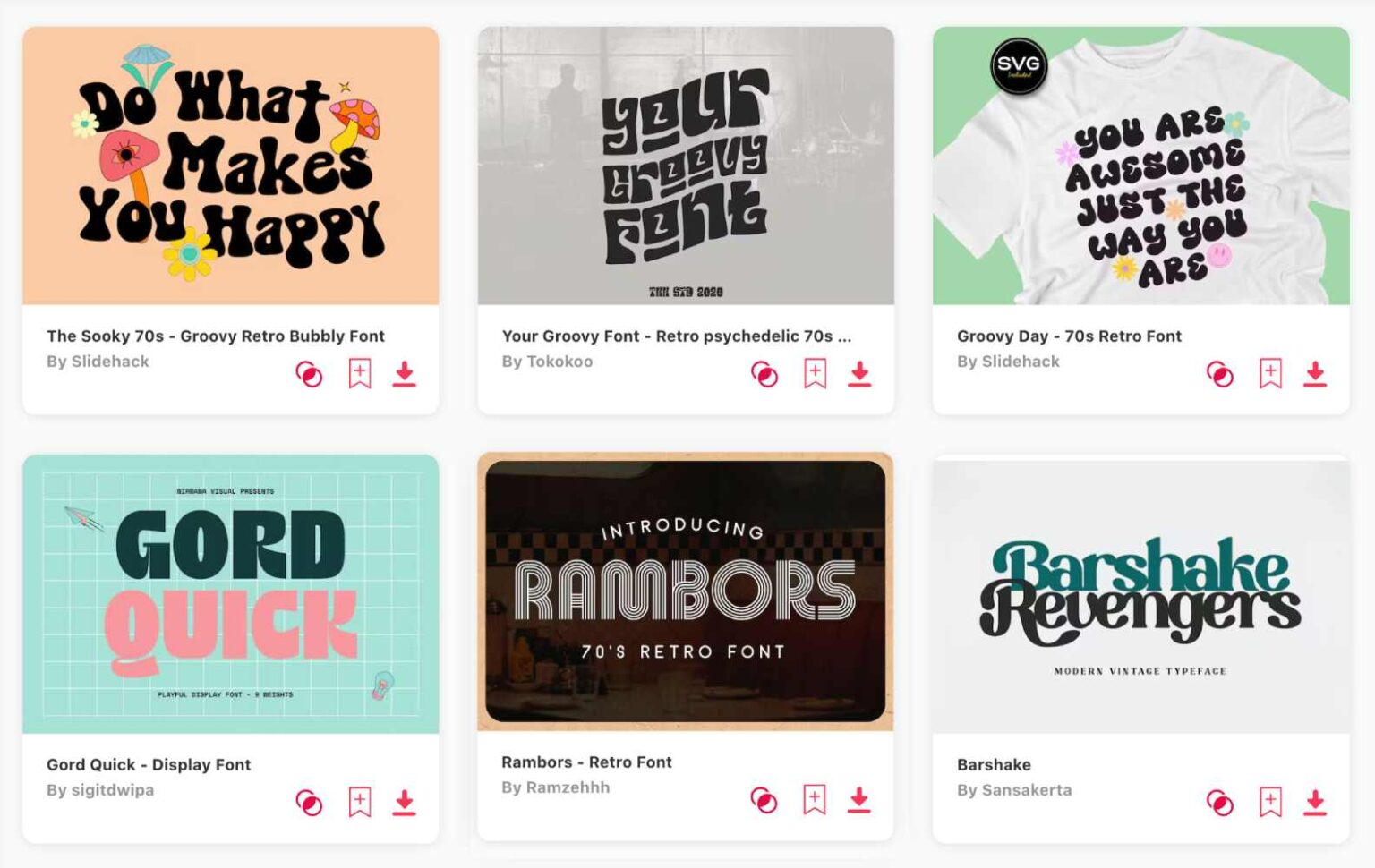
- The Psychedelic Era (1960s–1970s): Think bubble letters, distorted curves, and thick, expressive strokes. These fonts were designed to capture the rebellious and experimental spirit of the counterculture movement.
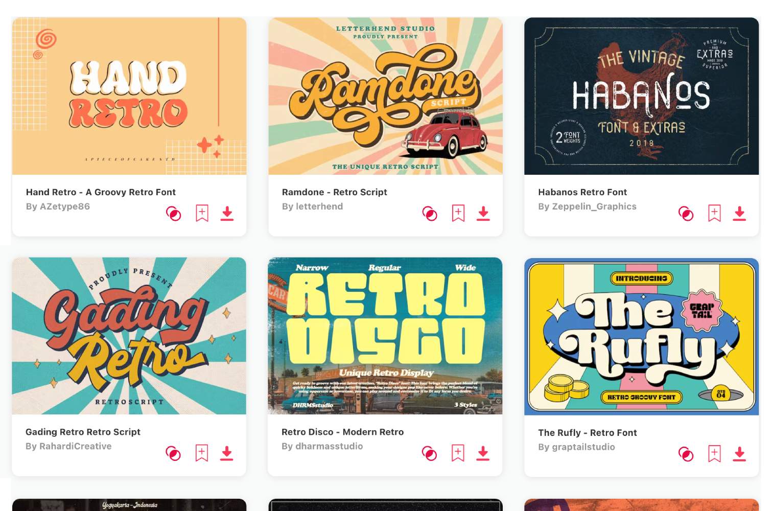
- The Disco and Funk Aesthetic (1970s–1980s): These fonts are typically chunky, bold, and often display an exaggerated weight. They are designed to stand out against high-contrast backgrounds like album covers or party flyers.
- Synthwave and Neon (1980s): Often inspired by futuristic sci-fi themes of that decade, these fonts usually feature sharp, angled serifs or monospaced designs that look like early computer terminal output.
By identifying the "vibe" of your design before searching, you filter out irrelevant styles and focus on fonts that align with your specific historical target.
Curating Top Retro Picks Within Canva
Canva updates its font library regularly to include professional-grade typefaces. While the specific availability can shift based on licensing agreements, several styles consistently serve as industry staples for retro-themed design.
1. The Bold & Bubble Look: "Tan Pearl" or "Gimme Danger"
For projects requiring a groovy, 70s-inspired look, fonts like "Tan Pearl" offer the organic, melting aesthetic associated with poster art from the era. These are ideal for headlines. If you need something slightly more aggressive, "Gimme Danger" provides a gritty, punk-rock retro energy that works well for event posters or merchandise branding.
2. The Mid-Century Elegant Look: "Cinzel" or "Tenor Sans"
If your goal is to replicate the professional polish of a 1950s lifestyle publication, serif fonts with unique contrast are essential. "Cinzel" mimics classical proportions but brings a retro-editorial feel, while "Tenor Sans" offers a softer, humanistic touch that feels like a vintage department store catalog.
3. The 80s Display Look: "Retro Stereo" or "Archive"
When you need to lean into the neon-drenched aesthetic, look for condensed or blocky fonts. "Archive" offers a heavy, structural weight that echoes the bold advertising of the 1980s. When paired with vibrant colors—like cyan, magenta, or electric yellow—these fonts instantly transport the viewer to the era of analog synthesizers.
Comparison of Retro Font Applications
| Font Style | Best Era Fit | Recommended Use | Visual Impact |
|---|---|---|---|
| Bubble/Curved | 1960s–70s | Headlines, Stickers | Playful, Psychedelic |
| High-Contrast Serif | 1940s–50s | Editorial, Logos | Sophisticated, Classic |
| Heavy Block/Slab | 1970s–80s | Posters, Social Media | Bold, Attention-Grabbing |
| Monospaced | 1980s | Retro-Tech, Headers | Nostalgic, Structured |
Strategic Implementation: How to Style Retro Text
A font alone does not make a design "retro"; it is the combination of typography, color palette, and texture. Even the best retro font in Canva will look out of place if the surrounding elements are too modern.
Color Pairing Strategy Retro design relies heavily on era-specific color theory. If you are using a 1970s font, avoid modern "digital" neons. Instead, utilize muted, earthy tones like mustard yellow, burnt orange, avocado green, and chocolate brown. For 1980s styles, contrast is king; use bold primary colors alongside neon accents to mimic the vibrant ink printing of that time.
Applying Text Effects Canva’s "Effects" panel is a powerful tool for enhancing retro typography. For the psychedelic look, use the "Curve" effect to create organic, wavy text paths. For a vintage signage feel, apply the "Lift" or "Shadow" effect to create depth, simulating the way physical letters would have sat on a storefront window. Note: Avoid over-using the "Neon" effect unless you are specifically aiming for an 80s synthwave look, as it can make high-contrast serifs look muddy.
Letter Spacing (Kerning) In the mid-20th century, typesetting was a physical craft. Vintage advertisements often featured very tight letter spacing (kerning) to save space, or very wide spacing to create a high-fashion editorial look. In Canva, select your text and click the "Spacing" icon. Adjust the "Letter Spacing" slider; shrinking it slightly can make a font feel more "vintage print," while expanding it can make a simple font feel more modern-editorial.
Avoiding Common Mistakes
One of the most frequent errors in retro-themed design is mixing too many styles. When working with retro fonts, which are often decorative or display-heavy, your secondary fonts must be simple.
- The Hierarchy Rule: Use your decorative "Retro" font for the main headline only. For subheadings and body text, choose a clean, neutral sans-serif or a highly legible, classic serif.
- The Over-Distortion Trap: While retro design allows for personality, never distort text so much that it becomes illegible. If a user cannot read your content within three seconds, the aesthetic choice has failed the communication goal.
- Formatting Consistency: Ensure your alignment is intentional. Retro posters often used centered text or creative, diagonal placements. Avoid standard "left-aligned" blocks unless you are creating a document-heavy piece like a faux-vintage menu.
Troubleshooting Technical Limitations in Canva
Users occasionally find that a specific font they admire is not displaying correctly or lacks special characters. If a retro font in Canva appears "broken" or missing glyphs (like accents or currency symbols), it is usually because that typeface was designed as a display font rather than a full-text typeface.
- Fallback Strategy: If your chosen retro font lacks an ampersand or punctuation, do not try to force it. Instead, switch to a "safe" secondary font for that specific character, or use a graphic element (like a line or a shape) to imply the punctuation.
- Licensing Awareness: Canva includes a vast library of fonts for Pro and Free users. If you are designing for commercial use (selling merchandise with your design), always verify that the font license is included in your Canva subscription. Canva’s licensing generally allows for use in commercial designs created within the platform, but you cannot download a Canva font to use in external software like Adobe Illustrator.
Frequently Asked Questions
1. Can I upload my own retro fonts to Canva? Yes, Canva Pro users can upload custom fonts. If you find a vintage font online that is not in the Canva library, ensure you have the correct commercial license (e.g., OTF or TTF file) before uploading it via the Brand Kit settings.
2. How do I make a font look "worn" or "vintage"? You can simulate aging by using Canva’s "Transparency" tool to lighten the text color or by layering your text over a "grunge" or "paper texture" image. Set the texture layer’s transparency to 10–20% to give your font a weathered, printed look.
3. What is the difference between a retro font and a vintage font? Generally, "vintage" refers to styles from the early 20th century or late 19th century, featuring intricate serifs and decorative flourishes. "Retro" typically refers to styles from the 1950s through the 1980s, emphasizing pop-culture aesthetics and mid-to-late century graphic design trends.
4. Why does my text look blurry when I export it? If your text looks blurry, ensure you are exporting as a "PDF Print" or "PNG" at a high resolution. If you have applied too many "Effects" (like glow or blur) to a thin font, it can cause rendering issues at smaller sizes. Simplify your effects to keep the edges sharp.
Next Steps for Your Project
To master retro typography on Canva, start by creating a "Brand Kit" folder within your account specifically for your retro project. Collect 3–5 fonts that represent the era you are targeting and test them against three different color palettes. By establishing these constraints early, you prevent decision fatigue and ensure that your final design feels cohesive and authentic rather than like a random collection of vintage-looking elements. Start your design by selecting one "hero" headline font and keeping all other supporting text minimal and legible.

Image Gallery
Select an image to open it in a new tab.


Omar Farooq
EdTech Innovation and Virtual Pedagogy Journalist
