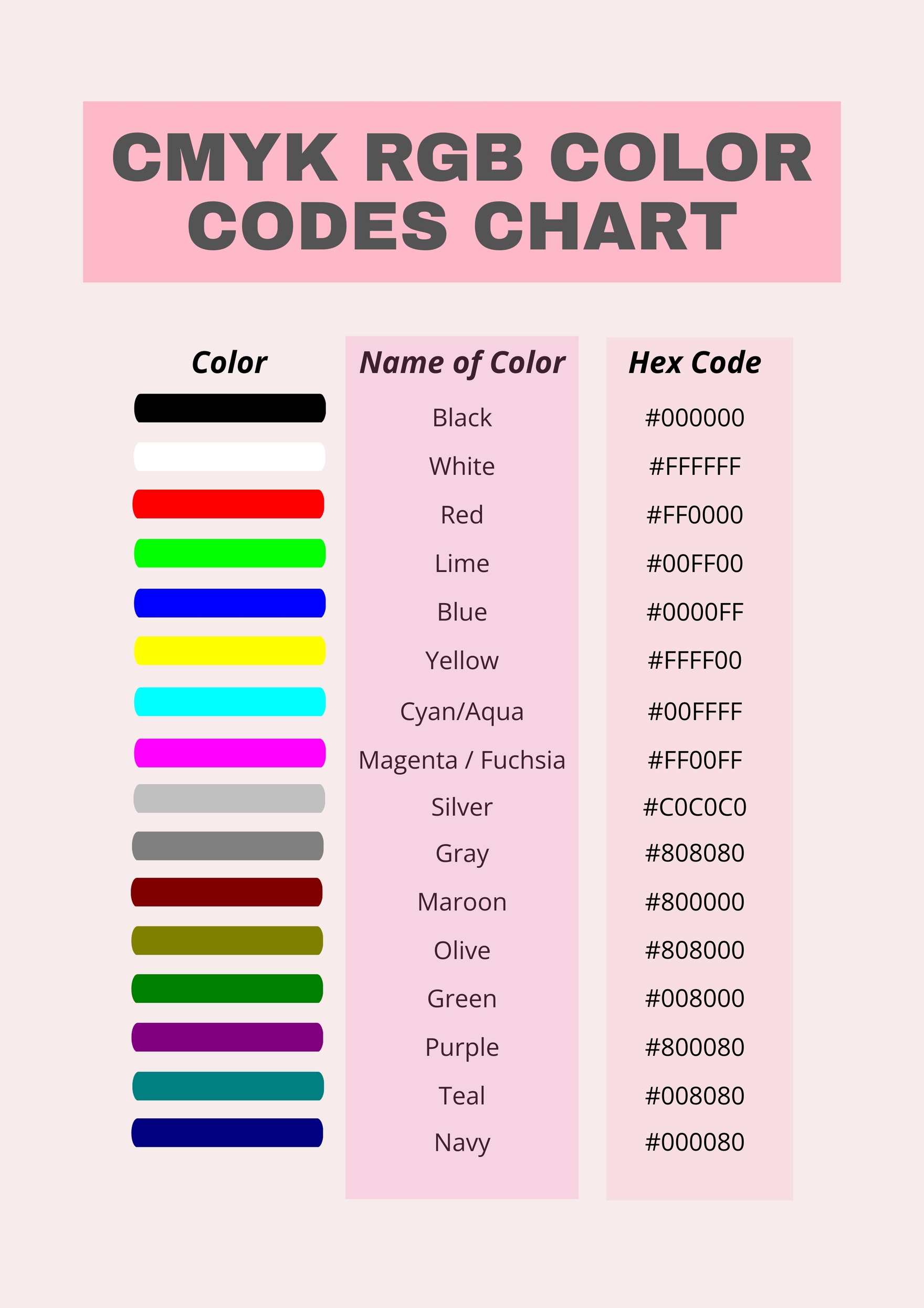
Neon CMYK colors are achieved by blending high-saturation process inks with specialized fluorescent spot colors or using optical design techniques to mimic luminosity. While traditional four-color printing has a limited gamut, modern expanded-gamut techniques and fluorescent inks allow designers to bridge the gap between glowing digital screens and high-impact physical print media.
The Physics of Vibrancy: Why Standard CMYK Struggles with Neon
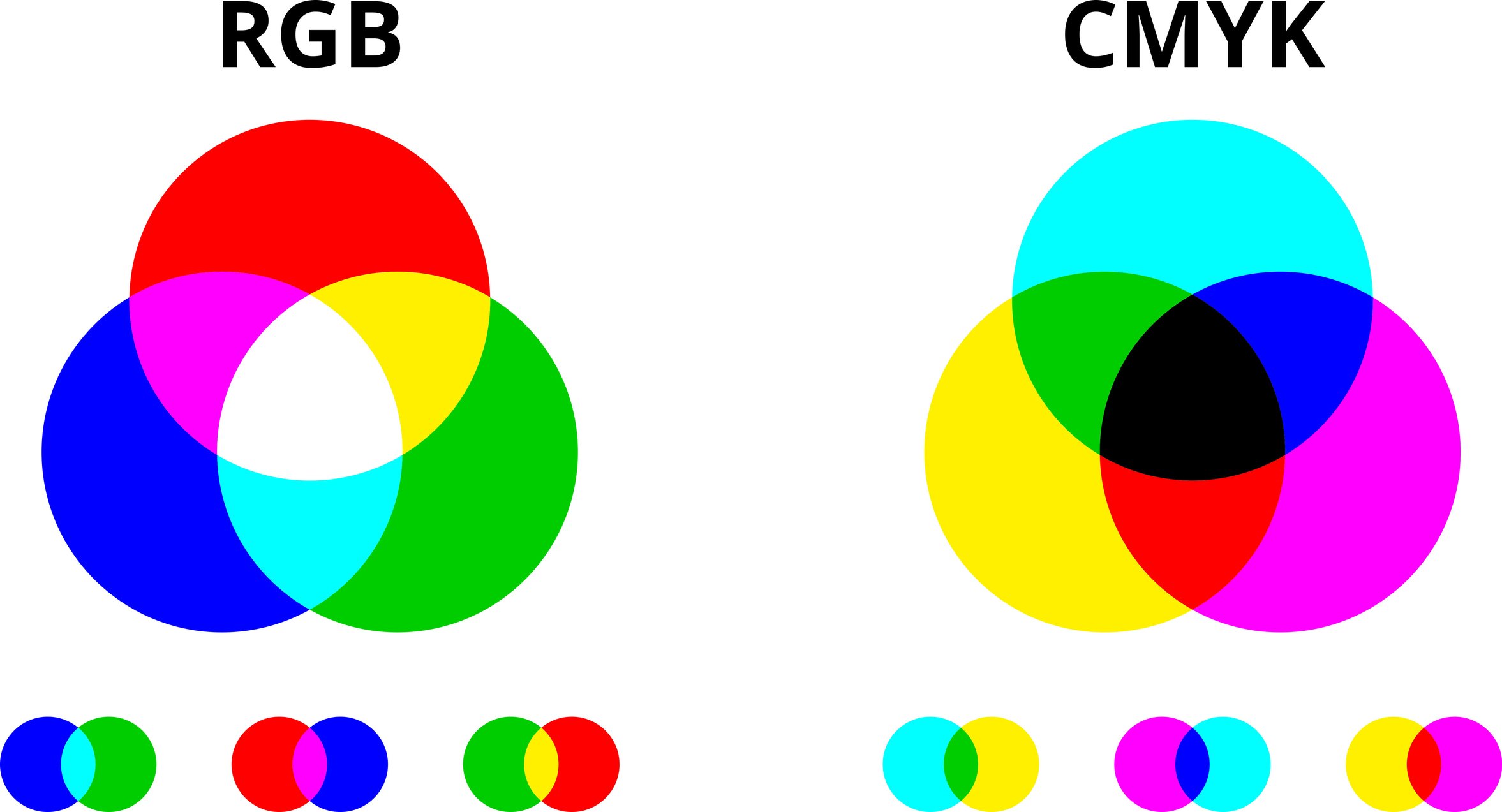
To understand how neon "lights up" a design, one must first address the fundamental limitation of the CMYK color model. Standard printing relies on the subtractive color model: Cyan, Magenta, Yellow, and Black (CMYK). In this system, inks act as filters, absorbing certain wavelengths of light and reflecting others. When you mix all three primary colors at maximum density, you theoretically get black (the absence of reflected light).
Neon colors, by contrast, are inherently "additive" in their visual behavior. True fluorescent pigments contain chemicals that absorb ultraviolet light—which is invisible to the human eye—and re-emit it as visible light at a longer wavelength. This process makes the color appear as though it is glowing or emitting its own light. Because standard CMYK inks are formulated to be subtractive and do not contain these fluorescent compounds, they cannot physically reach the brightness levels of a neon sign or an RGB (Red, Green, Blue) screen.
In the design landscape of 2026, the term "Neon CMYK" often refers to a hybrid approach. It involves the strategic use of the brightest possible combinations within the CMYK gamut, often supplemented by a fifth or sixth "spot" color. Designers must navigate the "gamut cliff," where the electric blues and vivid greens seen on a monitor fall flat when converted to a standard four-color press. Understanding this limitation is the first step toward overcoming it through technical precision and creative illusion.
Simulating Neon: Optical Illusions in Standard CMYK
When a project’s budget or the printing equipment does not allow for specialized fluorescent inks, designers must rely on color theory to create the illusion of neon luminosity. This is achieved primarily through contrast and value manipulation rather than the literal brightness of the ink.
The Power of Simultaneous Contrast
The human eye perceives color relative to its surroundings. A standard CMYK green (C:60, M:0, Y:100, K:0) will look vibrant on a white background, but it will appear to "glow" if placed against a rich, "rich black" (C:60, M:40, Y:40, K:100). By darkening the surrounding environment, the designer increases the perceived luminance of the CMYK ink. This is a foundational technique in "Neon CMYK" design; you aren't making the ink brighter, you are making the background darker to widen the dynamic range of the composition.
Using Gradients and Glows
To simulate the "aura" of a neon tube, designers use inner and outer glows. In a CMYK workflow, this involves creating a core of very light color (sometimes nearly white) and surrounding it with a highly saturated "halo." For example, a neon pink effect might use a core of 5% Magenta and 0% everything else, transitioning into a hard edge of 100% Magenta, which then bleeds out into a soft gradient of 70% Magenta and 20% Cyan. This mimics the way light scatters from a physical neon source, tricking the brain into perceiving a higher intensity than the ink actually provides.
The Role of Fluorescent Spot Colors (Pantone 800 Series)
For brands that require a physical glow that cannot be faked, the industry standard in 2026 remains the use of fluorescent spot colors, such as the Pantone 800 Series. These are not CMYK mixtures; they are pre-mixed inks that contain true fluorescent pigments.
When "lighting up" a design with these inks, they are usually treated as an "extra" plate in the printing process. This is known as 5-color or 6-color printing. The designer specifies a Pantone spot color (e.g., Pantone 806 C for a hot pink) in their layout software. The printer then loads that specific ink into a dedicated station on the press.
The impact of these inks is transformative. They provide a level of saturation that is mathematically impossible to achieve with Cyan, Magenta, Yellow, and Black alone. In 2026, many high-end packaging designs for electronics and cosmetics utilize a "Double Hit" of fluorescent ink—printing the same spot color twice in the same area—to increase the pigment density and maximize the neon effect.
Expanded Gamut Printing: Bridging the Gap in 2026
As of 2026, Expanded Gamut (EG) printing has become more accessible for mid-sized commercial projects. EG printing adds Orange, Green, and Violet (OGV) to the standard CMYK set. This "CMYK+OGV" approach significantly widens the color space, allowing for much more "neon-adjacent" colors.
| Feature | Standard CMYK | CMYK + Spot Neon | Expanded Gamut (OGV) |
|---|---|---|---|
| Luminosity | Low (Simulated only) | Extremely High (True Glow) | Moderate/High |
| Color Accuracy | Limited | Perfect (Per Swatch) | High |
| Cost | Baseline | High (Extra Plates/Ink) | Moderate (Standardized) |
| Best Use Case | Budget-friendly flyers | Luxury Branding/Safety | High-end Retail Packaging |
| Availability | Universal | Specialty Printers | Advanced Commercial Presses |
By adding these extra process colors, printers can hit approximately 90% of the Pantone library, including some of the high-saturation colors that previously required a dedicated spot ink. While OGV cannot truly "fluoresce" (emit light), it can reach the high-chroma oranges and electric greens that look dull in a standard 4-color process. This allows designers to "light up" their work with more complexity and nuance than a single spot color might allow.
Technical Requirements for Neon Print Files
Designing for neon requires a different "pre-flight" mindset than standard print work. Whether you are using simulations or spot colors, the technical setup of the file determines the success of the final output.
- Spot Color Naming: When using a true neon ink, the color must be defined as a "Spot" color type in software like Adobe Illustrator or InDesign. This ensures the RIP (Raster Image Processor) at the print shop recognizes it as a separate ink plate rather than trying to break it down into CMYK percentages.
- Overprinting and Trapping: Because neon inks are often semi-transparent, they can change color if printed over other inks. Designers must decide whether to "knock out" the background (leaving a hole for the neon ink) or "overprint" (letting the neon ink sit on top). Overprinting a neon pink on top of a yellow can create a stunning, luminous orange, but overprinting it on blue may result in a muddy purple.
- Rich Black Integration: To make neon CMYK simulations work, the "Black" must be deep. A standard 0/0/0/100 Black often looks charcoal-grey on press. Using a "Rich Black" (typically 60/40/40/100) provides a denser, cooler background that makes "neon" CMYK elements appear significantly brighter by comparison.
The Evolution of Digital Neon: Fluorescent Toners
In 2026, digital printing technology has evolved to include "Neon Toners" for short-run projects. Previously, true neon was the domain of expensive offset lithography. Now, dry-toner and liquid-ink digital presses (such as the HP Indigo series) offer "Fluorescent Pink," "Fluorescent Yellow," and "Fluorescent Orange" toners.
This technology allows for variable data printing—meaning every single piece in a print run can have a unique neon element. For event marketing or limited-edition packaging, this "lights up" the design by adding a premium, tactile quality that was previously unattainable for small businesses. These toners can even be blended with standard CMYK to create "Neon-CMYK" hybrids, resulting in a spectrum of glowing peaches, limes, and lavenders.
Common Mistakes When Working with Neon CMYK
Achieving a "light-up" effect is difficult, and several common errors can ruin the visual impact of the design:
- Relying on Screen Accuracy: RGB monitors can display colors far brighter than any CMYK ink. Designers often choose a "Neon" color on screen that turns into a dull mustard or dark teal in print because they didn't check the "Out of Gamut" warning in their software.
- Insufficient Contrast: If a simulated neon color is placed on a medium-value background (like grey or tan), the "glow" effect is neutralized. The eye needs a dark or highly complementary anchor to perceive luminosity.
- Ignoring Paper Stock: Neon inks are highly sensitive to the surface they are printed on. On uncoated, porous paper, the fluorescent pigments are absorbed into the fibers, significantly dulling the glow. To truly "light up" a design, high-quality coated (gloss or matte) paper is required to keep the pigment on the surface where it can interact with light.
Future Outlook: Interactive and Phosphorescent Inks
Looking toward the end of 2026 and beyond, the definition of "lighting up" a design is expanding to include phosphorescent and photochromic inks. While neon inks glow under UV light, phosphorescent inks (glow-in-the-dark) store energy and emit it in total darkness.
Furthermore, "Smart Inks" are beginning to enter the luxury packaging market. These inks can change color or intensity based on temperature or light exposure. While these are technically distinct from the CMYK model, they are often integrated into CMYK workflows to create multi-sensory experiences. For a designer, this means that "Neon CMYK" is no longer just a static color choice, but a component of a dynamic, light-reactive system.
Troubleshooting Neon CMYK Issues
If your "Neon" design looks flat upon proofing, check the following variables:
- Ink Density (Dmax): Ask your printer if they can increase the ink limit for the specific "Neon" areas.
- Under-printing White: If printing on a dark or metallic substrate, you must print a "White Under-base" first. Without it, the neon or high-saturation CMYK inks will be swallowed by the dark background, losing all luminosity.
- Varnish and Coatings: A gloss aqueous coating or UV varnish can often enhance the perceived saturation of CMYK "neon" simulations by increasing light reflection off the surface of the paper.
FAQ: Frequently Asked Questions
Can I print neon colors on a standard home or office printer?
Standard home printers use basic CMYK ink sets that lack fluorescent pigments. While you can print "bright" colors, they will not glow or have the vibration of professional neon. To get a neon effect at home, you would need to purchase specialized fluorescent ink cartridges specifically designed for your printer model, which are rare and typically limited to specialty craft printers.
What is the best CMYK formula for a "Neon Green" look?
While true neon isn't possible, the most "electric" green in standard CMYK is generally C:63, M:0, Y:100, K:0. To make this look like it is lighting up, surround it with a dark, cool black (C:70, M:50, Y:30, K:100). This maximizes the "vibration" between the yellow-heavy green and the blue-heavy black.
Why do my neon colors look brown or muddy when I convert from RGB to CMYK?
This happens because RGB is an additive light model with a much wider gamut than the subtractive CMYK model. When a computer "forces" a bright neon RGB color into CMYK, it often adds Cyan or Magenta to a bright Yellow to try and match the hue, which inadvertently lowers the brightness and creates a "muddy" appearance. Manual adjustment is always better than an automatic conversion.
Is it more expensive to print with neon spot colors?
Yes. Using a Pantone 800-series spot color requires an additional "station" on the printing press, which increases setup time and material costs. However, for 2026 marketing standards, the "stopping power" of a true neon ink often provides a higher return on investment (ROI) by significantly increasing brand visibility on a crowded shelf.
Does neon ink fade faster than regular CMYK ink?
Historically, yes. Fluorescent pigments are less lightfast than standard pigments because the chemical reaction that creates the glow also causes the molecules to break down faster when exposed to sunlight. If your design is for outdoor use (like a billboard), you should specify a UV-resistant clear coat to protect the neon intensity.
Practical Recommendation
When your goal is to "light up" a design using CMYK, start by defining your budget. If you have the resources, always opt for a Pantone 800-series Spot Color or a Digital Fluorescent Toner as a fifth color. If you must stay within a strict 4-color CMYK budget, focus your efforts on maximizing contrast. Use "Rich Black" backgrounds and incorporate white "cores" in your glowing elements to trick the viewer’s eye into perceiving a higher level of luminance than the ink alone can provide. Always request a "Press Proof" rather than a digital proof to ensure the physical interaction of the ink and paper achieves the desired "neon" energy.
Image Gallery
Select an image to open it in a new tab.
Simon Caldwell
Enterprise Technology and Systems Editor
