
Dynamic modes allow digital interfaces to adapt automatically to user preferences and environmental contexts, such as ambient lighting, battery levels, or specific accessibility needs. They are essential because they reduce cognitive load, improve accessibility for neurodivergent and visually impaired users, and respect the personal agency of modern consumers within complex, multi-device ecosystems.
The Evolution of Dynamic Modes in Modern Design Systems
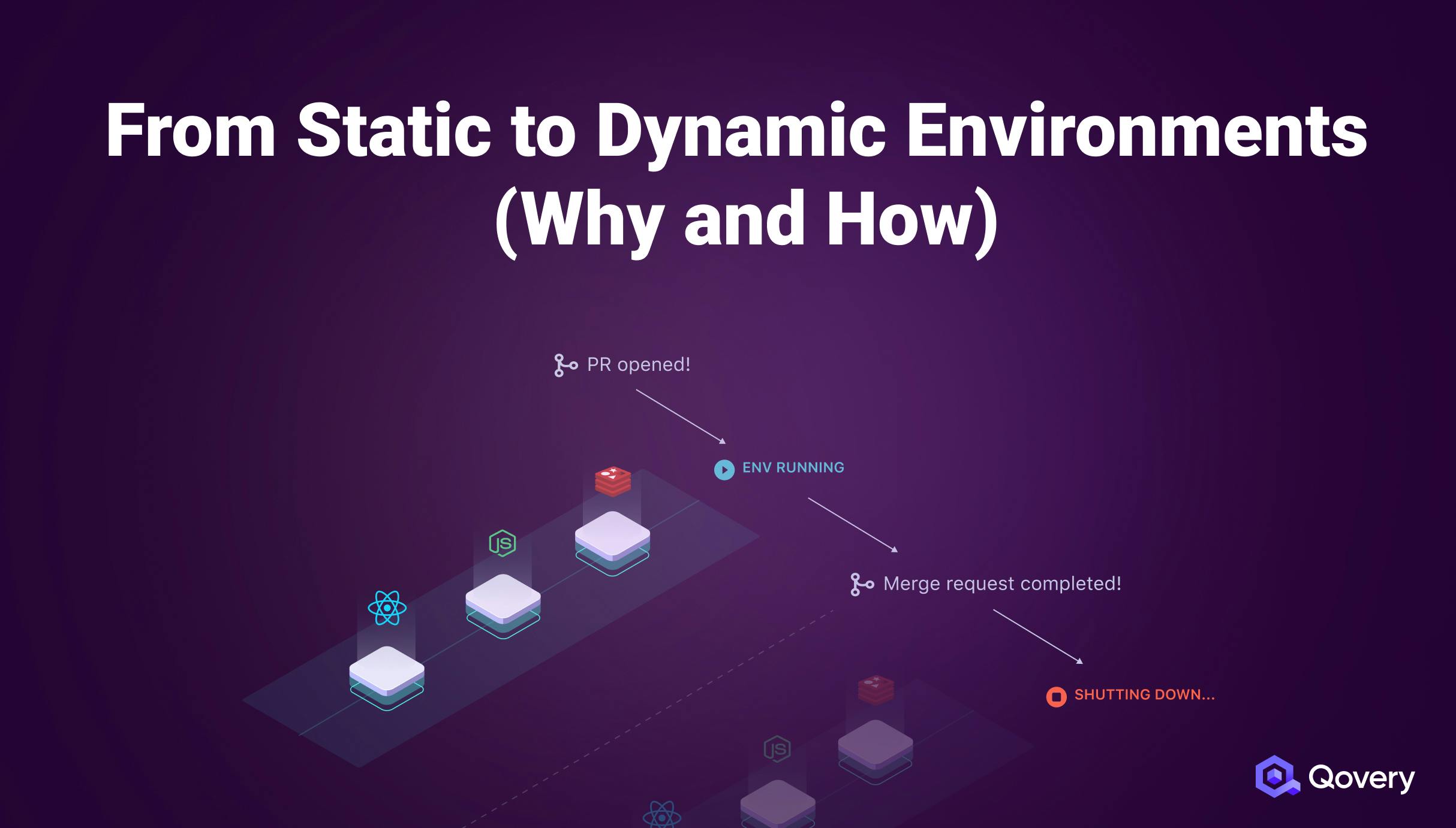
In the landscape of 2026, design is no longer a static discipline focused on a singular "perfect" layout. Instead, it has evolved into the creation of fluid systems capable of responding to a vast array of user-side signals. Dynamic modes—ranging from the ubiquitous dark and light themes to more nuanced high-contrast, reduced-motion, and data-saver modes—represent the shift from "designing for the screen" to "designing for the human."
Historically, designers controlled every pixel. A brand's identity was tied to a specific color palette and a fixed set of animations. However, as mobile usage overtook desktop and wearable technology became integrated into daily life, the "one-size-fits-all" approach failed. Users began demanding more control over how they consumed information. This demand gave rise to system-level preferences that applications must now honor. When a design supports dynamic modes, it acknowledges that the environment in which an app is used (a bright sunny park vs. a dark bedroom) is just as important as the app's internal logic.
By 2026, supporting these modes is not merely a "feature" but a foundational requirement of any robust design system. Whether utilizing Material Design 3 guidelines or Apple’s Human Interface Guidelines, the industry has standardized the way interfaces listen to system signals. This technical maturity allows for a more seamless handoff between the user's intent and the interface's execution.
Accessibility as the Primary Driver
The most significant reason dynamic modes matter is their role in digital accessibility. For years, accessibility was treated as a checkbox for compliance. Today, it is understood as a core component of user experience. Dynamic modes provide the necessary tools to accommodate "situational," "temporary," and "permanent" disabilities.
Visual Impairments and High Contrast
Users with low vision or color vision deficiency often struggle with modern, subtle UI designs that favor low-contrast aesthetics. Dynamic high-contrast modes allow these users to increase the visibility of text and UI elements without the designer having to compromise the "standard" look for the general population. This is a practical application of the "Curb-Cut Effect," where a feature designed for a specific disability ends up benefiting a much larger group of people.
Vestibular Disorders and Reduced Motion
For users with vestibular disorders, certain animations—like parallax scrolling, zooming, or rapid sliding—can cause physical nausea or dizziness. The "Reduced Motion" dynamic mode allows designers to provide the same functional feedback (like a button being pressed) using non-triggering transitions, such as simple fades. This ensures that the interface remains usable for everyone, regardless of their sensitivity to motion.
Neurodiversity and Focus
Dynamic modes also cater to neurodivergent users, including those with ADHD or autism. Features like "Focus Mode" or "Simplified View" reduce visual noise and clutter, allowing the user to concentrate on the primary task. By stripping away secondary navigation or distracting advertisements dynamically, the design respects the user's cognitive bandwidth.
Ergonomics and Physical Well-being
Beyond accessibility, dynamic modes address the physical impact of prolonged screen use. Digital eye strain, or computer vision syndrome, is a documented health concern. Dynamic modes mitigate this by adjusting the interface to match the user's circadian rhythm and local environment.
Circadian Rhythms and Blue Light
As evening approaches, many operating systems shift the display color temperature toward the warmer end of the spectrum to reduce blue light exposure. Design systems that are "mode-aware" can complement this by shifting their own color palettes. For instance, a news application might transition from a high-energy white background in the morning to a muted, sepia, or dark-gray background in the evening. This synchronization helps maintain the user's natural sleep-wake cycle, making the technology feel like a supportive tool rather than a disruptive one.
Battery Life and Hardware Efficiency
On devices with OLED or AMOLED screens, dark mode is more than an aesthetic choice; it is a power-saving necessity. Because these screens turn off individual pixels to display black, a dark interface significantly reduces energy consumption. For users in 2026 who rely on mobile devices for everything from transit to payments, an extra 20% of battery life gained through an efficient dynamic mode can be the difference between a functional device and a dead one. Designers who ignore this reality are effectively designing "inefficient" products.
Technical Implementation: The Power of Design Tokens
Achieving a high-quality dynamic interface requires a departure from hard-coded hex values. The modern standard involves the use of design tokens. These are semantic variables that store design decisions. Instead of telling a button to be #007AFF, a designer tells it to use the token primary-action-color.
When the user switches from light to dark mode, the system simply swaps the value of primary-action-color at the root level. This approach ensures consistency across thousands of screens and components. It also allows for "graceful degradation." If a specific mode is not fully designed, the system can fall back to a safe default without breaking the layout.
The implementation of these modes relies heavily on CSS media queries like prefers-color-scheme and prefers-reduced-motion. These queries act as listeners, allowing the browser or application to react instantly when the user toggles a setting in their OS. In 2026, the complexity has increased to include prefers-contrast and even custom environmental sensors that can detect the ambient light level in lux, enabling the UI to adjust its brightness and contrast ratio in real-time.
The Business and Legal Imperative
There is a compelling business case for investing in dynamic modes. As global regulations like the European Accessibility Act (EAA) and updated WCAG 2.2 standards become more strictly enforced, companies that fail to provide accessible, adaptive interfaces face legal risks and potential fines.
From a marketing perspective, dynamic modes enhance brand loyalty. When a user finds an app that respects their settings—such as automatically switching to dark mode at 8:00 PM—they perceive the brand as more "premium" and "thoughtful." This attention to detail reduces churn. If a user has a vestibular disorder and your competitor’s app makes them feel sick while yours respects their "reduced motion" setting, the choice of which app to use becomes a matter of physical comfort.
Comparative Matrix of Dynamic Mode Functions
The following table outlines the most common dynamic modes used in 2026 and their primary benefits to the user and the system.
| Mode Name | Primary Trigger | Main User Benefit | Technical Requirement |
|---|---|---|---|
| Dark Mode | User preference or sunset | Reduced eye strain; OLED battery saving | Semantic color tokens (Light/Dark variants) |
| High Contrast | Accessibility settings | Enhanced legibility for low-vision users | Increased luminosity contrast ratios (>7:1) |
| Reduced Motion | Accessibility settings | Prevention of motion sickness/vertigo | Replacement of movement with opacity shifts |
| Data Saver | Low bandwidth or user toggle | Reduced data costs; faster loading | Loading low-res assets or removing background sync |
| Auto-Brightness | Ambient light sensors | Visibility in direct sunlight | Real-time CSS custom property updates |
| Focus/Quiet Mode | Scheduled or manual toggle | Reduced cognitive load and distraction | Suppression of non-critical UI elements |
Cognitive Load and User Agency
Modern design philosophy places a high value on "User Agency"—the feeling that the user is in control of their digital environment. When a design forces a bright white screen on a user in a dark room, it is an act of digital intrusion. By providing dynamic modes, designers relinquish a small amount of aesthetic control in exchange for a massive gain in user trust.
Cognitive load is the total amount of mental effort being used in the working memory. An interface that does not adapt to its context increases this load. For example, if a user has to squint to read low-contrast text while outdoors, their brain is working harder just to perceive the information, leaving less energy to process the actual content. Dynamic modes automate these adjustments, "smoothing out" the interaction so the interface becomes almost invisible, which is the ultimate goal of good UX.
Common Pitfalls in Dynamic Design
While the benefits are clear, implementing dynamic modes incorrectly can lead to a poor experience. One common mistake is "pure black" dark modes. While they save the most battery, they can cause "smearing" on some OLED screens when scrolling. A dark gray (#121212) is often preferred for readability.
Another mistake is failing to test brand colors across all modes. A logo that looks vibrant on white may disappear entirely on a dark background or look muddy in high-contrast mode. Designers must verify that their brand identity remains recognizable and legible across the entire spectrum of possible states. This requires rigorous testing using tools like axe DevTools or built-in browser emulators.
Expert Guidance: Preparing for Future Modes
As we look toward the latter half of 2026 and beyond, we expect to see even more granular dynamic modes. "Biometric-adaptive" modes may soon adjust the UI based on the user's stress levels (detected via wearables) or eye fatigue. Designers should prepare by building flexible, token-based systems today.
The key to success is semantic naming. Do not name a color token light-blue. Name it surface-secondary. This allows the "meaning" of the color to remain constant while the "value" changes based on the mode. This abstraction is what enables a design system to scale and adapt to technologies that haven't even been invented yet.
FAQ
Does Dark Mode actually save battery life?
Yes, but primarily on devices with OLED or AMOLED screens. On these displays, each pixel is individually lit. Black pixels are simply pixels that are turned off, consuming zero power. On traditional LCD screens, a backlight is always on regardless of the color shown, so the power savings are negligible. However, the ergonomic benefits for eye strain remain regardless of screen technology.
Should I let users toggle modes manually or follow the system settings?
The best practice is to do both. By default, your application should respect the system-level settings (using prefers-color-scheme). However, you should also provide an in-app toggle that allows users to override the system setting. This accommodates users who might want their OS in light mode but prefer a specific app (like a code editor or video player) in dark mode.
How do dynamic modes affect SEO and web performance?
Properly implemented dynamic modes have a neutral to positive effect on SEO. While the CSS might be slightly larger to accommodate multiple themes, the improvement in "User Experience" signals—such as longer time-on-site and lower bounce rates—often outweighs the small increase in file size. Furthermore, accessible sites are generally prioritized by search engines.
Is High Contrast Mode the same as Dark Mode?
No. While Dark Mode uses a dark palette, it still maintains a variety of colors and subtle gradients. High Contrast Mode (often seen in Windows as "Contrast Themes") strips away almost all styling to provide the maximum possible difference between foreground and background, often using a very limited palette of stark colors like neon yellow on black.
What is the "Reduced Motion" mode specifically for?
It is primarily for individuals with vestibular (inner ear) disorders who experience dizziness or nausea when viewing movement on a screen. However, it is also preferred by many users who simply find animations distracting or feel that they make the interface feel "slow."
Recommendation for Designers and Developers
To stay competitive in 2026, prioritize the implementation of a token-based design system. Begin by auditing your current interface for accessibility "failure points"—specifically focusing on color contrast and motion triggers. Use the WCAG 2.2 guidelines as your roadmap. By moving away from static layouts and embracing a dynamic, signal-responsive architecture, you ensure that your product remains accessible, efficient, and user-centric in an increasingly diverse hardware environment.
Image Gallery
Select an image to open it in a new tab.

Vivian Cho
Executive IT and Emerging Technologies Reporter
